Hi everyone !
I've just looked at all the participations here and I want to bring my opinion on some of them.
First of all, as LXDE is meant to be really light, I thought the logo would be just a simple flat ubuntu logo with the color changed ; but then I realized some people could confuse lubuntu with ubuntu then.
The problem is, and please forgive me for saying that, the LXDE logo is really terrible. It's meant to look like a bird apparently, but to me it looks more like bird's poo than anything else. Also, the four spikes of the LXDE logo, even if they can be linked to the concept of "speed", are very aggressive. And so I highly support the few ones who thought about redesigning the LXDE logo even if, again, a lot of work has to be made.
Some people (in fact, only TnelsonD apparently) submissions are lightyears from the concept of "simple" and "light" ; a graphicaly overloaded logo will be more repulsive than anything and won't be in adequation with the key features of LXDE.
The submission the most appropriate in my opinion is the first one from honki
honki wrote:hi,all ,i am from taiwan.i design something for lxde.thx.
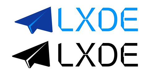
lxde logo

lubuntu logo
lubuntu
I truly believe that thoses 3 submissons here are fantastic and could be considered as a definitive proposition.
The paper plane for the LXDE logo idea is very smart as it evoke something really simple and light (and so is the logo with only two colors). The only thing I would discuss is the bad choice for the font. This "futuristic" font is more "geeky" than anything and it should instead be replaced by a free equivalent of a "
Helvetica Neue Ultra-Light" or a "
Frutiger Light" like.
As for the lubuntu font, I currently have no suggection.
Last point, the idea merged to change the colors from the original variants of blue. This is a good idea, but it's also dangerous ; as maces stated, it can easily be aggressive to the eye because you used the wrong color. Therefore I believe yellow is a color to avoid, but green (
as used in the openSUSE logo) or purple (
as in the flag of Tokyo prefecture) and their variants can be a good choice.
Of course all of this is my personal opinion and you are free not to agree with me.
