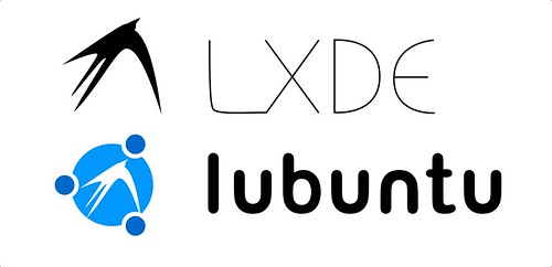
I like Leo's submissions better. The lubuntu logo really should be the standard ubuntu circle in an appropriate color (stages of blue) with the current LXDE "X" in the middle, with the "lubuntu" in the standard ubuntu typeface (font).
Regarding honki's submissions above, the "L" in Lubuntu's typeface, should be lower-case, as all of the other ubuntu-related projects are this way.
Artwork for Lubuntu
Re: Artwork for Lubuntu
Debian Sid - LXDE
Re: Artwork for Lubuntu
I throw out my wallpaper used years to net this week, and some are on Gnmoe-Look.
Here is the link: http://gnome-look.org/usermanager/search.php?username=freedman&action=contents&PHPSESSID=c900c83ad869b99d7688efe2afa26c09
The package is here(41.92MB): http://sharebee.com/27a36b51
Lite package is here(3.44MB): http://sharebee.com/0c9e8941
Well, JUST FOR REFERENCE...
Here is the link: http://gnome-look.org/usermanager/search.php?username=freedman&action=contents&PHPSESSID=c900c83ad869b99d7688efe2afa26c09
The package is here(41.92MB): http://sharebee.com/27a36b51
Lite package is here(3.44MB): http://sharebee.com/0c9e8941
Well, JUST FOR REFERENCE...
- Attachments
-
- XWindowG.jpg (23.51 KiB) Viewed 134765 times
-
levviathor
- Posts: 3
- Joined: Sun Oct 25, 2009 3:40 am
Re: Artwork for Lubuntu
Couldn't resist whipping up a draft logo.
Basically taken from a post earlier in the thread.
I took the colors from a logo on page 8. Not sure if they are correct.
Basically taken from a post earlier in the thread.
I took the colors from a logo on page 8. Not sure if they are correct.
- Attachments
-
- lubuntu-logo.png (20.2 KiB) Viewed 134669 times
Re: Artwork for Lubuntu
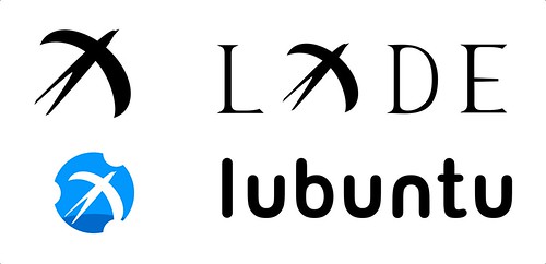
hi , i design two logo about lubuntu and lxde.
thx.


thx.
Last edited by honki on Fri Oct 30, 2009 3:28 am, edited 1 time in total.
-
AleatoricConsonance
- Posts: 5
- Joined: Fri Oct 30, 2009 2:50 am
Re: Artwork for Lubuntu
Hi,
I've done an idea for a logo. LXDE is a simple lightweight desktop, and I feel the logo should reflect that.

And against a gradient background:

It's really hard job to make the spiky abstract of LXDE fit harmoniously with the smooth circles of the Ubuntu logo, but I think Honki (above) has done an excellent job.
I've done an idea for a logo. LXDE is a simple lightweight desktop, and I feel the logo should reflect that.
And against a gradient background:
It's really hard job to make the spiky abstract of LXDE fit harmoniously with the smooth circles of the Ubuntu logo, but I think Honki (above) has done an excellent job.
Re: Artwork for Lubuntu
i agree your idea of logo.AleatoricConsonance wrote:Hi,
I've done an idea for a logo. LXDE is a simple lightweight desktop, and I feel the logo should reflect that.
And against a gradient background:
It's really hard job to make the spiky abstract of LXDE fit harmoniously with the smooth circles of the Ubuntu logo, but I think Honki (above) has done an excellent job.
i think that the spiky abstract of LXDE logo is big problem so.
Re: Artwork for Lubuntu
I'm new here, so I don't know who's toes to not step on. Anyways, I'll be saving and converting all non-vector images into both vector and PDF images. If the background is transparent, the background will remain transparent.
If anyone objects to their art being converted, please let me know which images to leave in raster format and I'll be sure to leave them alone.
If anyone objects to their art being converted, please let me know which images to leave in raster format and I'll be sure to leave them alone.
Re: Artwork for Lubuntu
I still like Leo's images that are displayed on Page 8 of this topic. 
Debian Sid - LXDE
-
levviathor
- Posts: 3
- Joined: Sun Oct 25, 2009 3:40 am
Re: Artwork for Lubuntu
I like AleatoricConsonance's logos more than mine. The LXDE bird is much more obvious, and it just Feels Better.
However, the logo is tilted about 30 degrees to the right--I'm not sure if that's acceptable or not. I think the concept could still work with the logo upright.
See the LXDE logo at the top of the forum page to see what I mean.
However, the logo is tilted about 30 degrees to the right--I'm not sure if that's acceptable or not. I think the concept could still work with the logo upright.
See the LXDE logo at the top of the forum page to see what I mean.
Re: Artwork for Lubuntu
Hi,
Sorry for randomly posting like this. I just looked over and realized that all the variants of Ubuntu has logo's that are colored in blue. So, I was thinking of "why not make Lubuntu unique" with colors such as black, white, or even green.
Thanks for reading this post
^_^ Best of luck to everyone, and continue being great!