Hello to everyone.
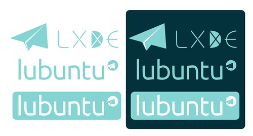
The "paperplane" logo, brilliant idea, very professional work.
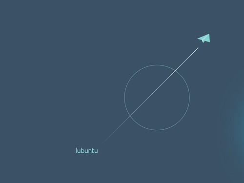
If you happened to be in search of a way to be closer to the "Ubuntu family" in terms of image, here is an idea: keep the base logo, keep the idea of the three people connected, and simplify it to gain visual power.
Less might be more sometimes, in this case the philosophy of the distribution could be applied to the logo.
Instead of "adding" (a distinctive shape that would be representative of the unique personality of the distro), having this simplicity applied to the "family logo" (the distro already has a distinctive color) might represent fully Lubuntu.
Here are "hints", and kind of a "progress sheet" for you to see the process.
(These are only hints and should not be regarded as a finished product.)
Made with Inkscape, modifying this file. Thanks to the original artist.
http://remonster.homelinux.org:81/ar/node/430
Best to you all.